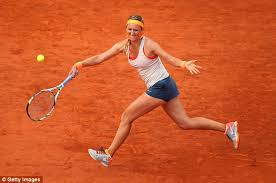
These looks failed to inspire during the 2013 Roland Garros tournament.
1. Gael Monfils - Complete Shank
Gael - this shirt is hideous. I don't even know why, because I like the colors and stripes - but just terrible. Quel horreur!

2. Svetlana Kuznetsova - Miss-hit
I can't fathom which company would think that the French would accept tie dye. What were they thinking?

3. Sloane Stephens - Double Fault
Neon green/yellow works well on blue hardcourts but it was jarring to see the color against the terre battue. Also, the outfit seemed way too short for Sloane.

4. Maria Sharapova - Unforced Error
Not a fan of the 90s baby doll/slip dress look that Maria's been trying to rock. The little triangle detail on the straps also seem antiquated. But hey - Sugarpova's laughing and shrieking her way to the bank.

5. Victoria Azarkena - Bad Toss
I usually like Vika's understated and un-complicated Nike kits but this one didn't work for me. I get that she's in the same color palette as Serena - but Vika just ends up looking washed out and dull against the clay.

1. Gael Monfils - Complete Shank
Gael - this shirt is hideous. I don't even know why, because I like the colors and stripes - but just terrible. Quel horreur!
2. Svetlana Kuznetsova - Miss-hit
I can't fathom which company would think that the French would accept tie dye. What were they thinking?
3. Sloane Stephens - Double Fault
Neon green/yellow works well on blue hardcourts but it was jarring to see the color against the terre battue. Also, the outfit seemed way too short for Sloane.
4. Maria Sharapova - Unforced Error
Not a fan of the 90s baby doll/slip dress look that Maria's been trying to rock. The little triangle detail on the straps also seem antiquated. But hey - Sugarpova's laughing and shrieking her way to the bank.
5. Victoria Azarkena - Bad Toss
I usually like Vika's understated and un-complicated Nike kits but this one didn't work for me. I get that she's in the same color palette as Serena - but Vika just ends up looking washed out and dull against the clay.
Comments
Post a Comment